
What is Chefooni?
Chefooni is a meal-kit brand that brings back joy and ease to home cooking.
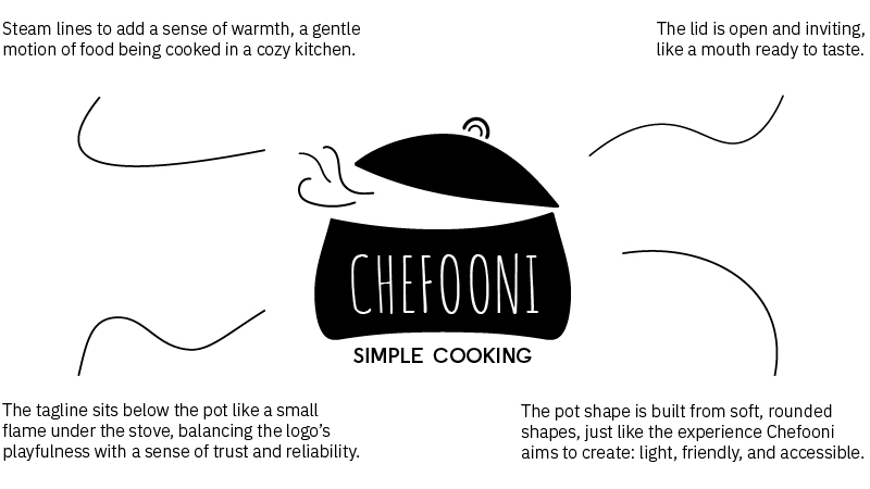
The visual identity was designed to reflect Chefooni’s key ideas of lightness, inclusivity, and joy through soft shapes, hand-drawn typography, and a warm, inviting color palette.
The overall tone is friendly and optimistic, celebrating the task of everyday cooking as something simple, creative, and enjoyable.
Logo
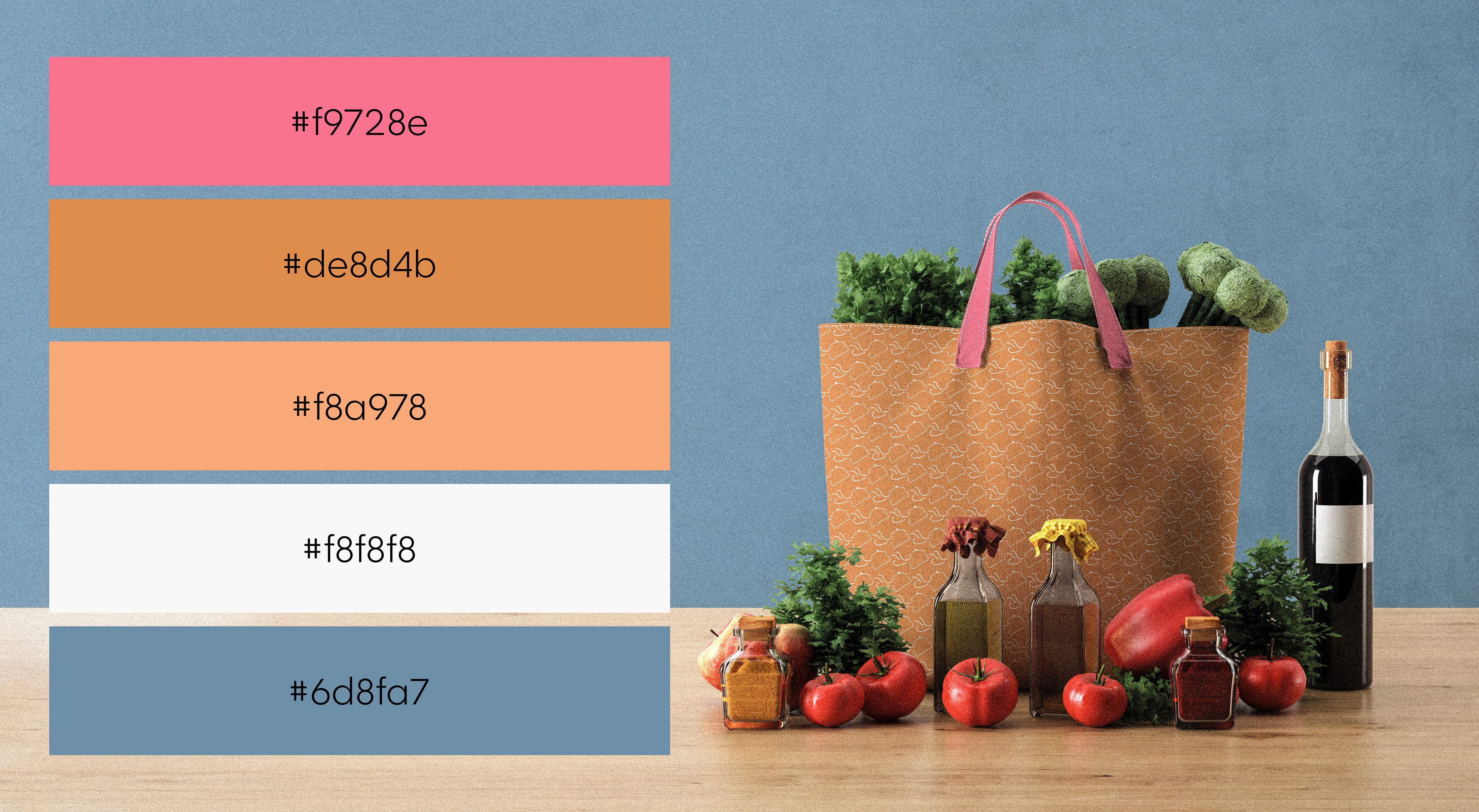
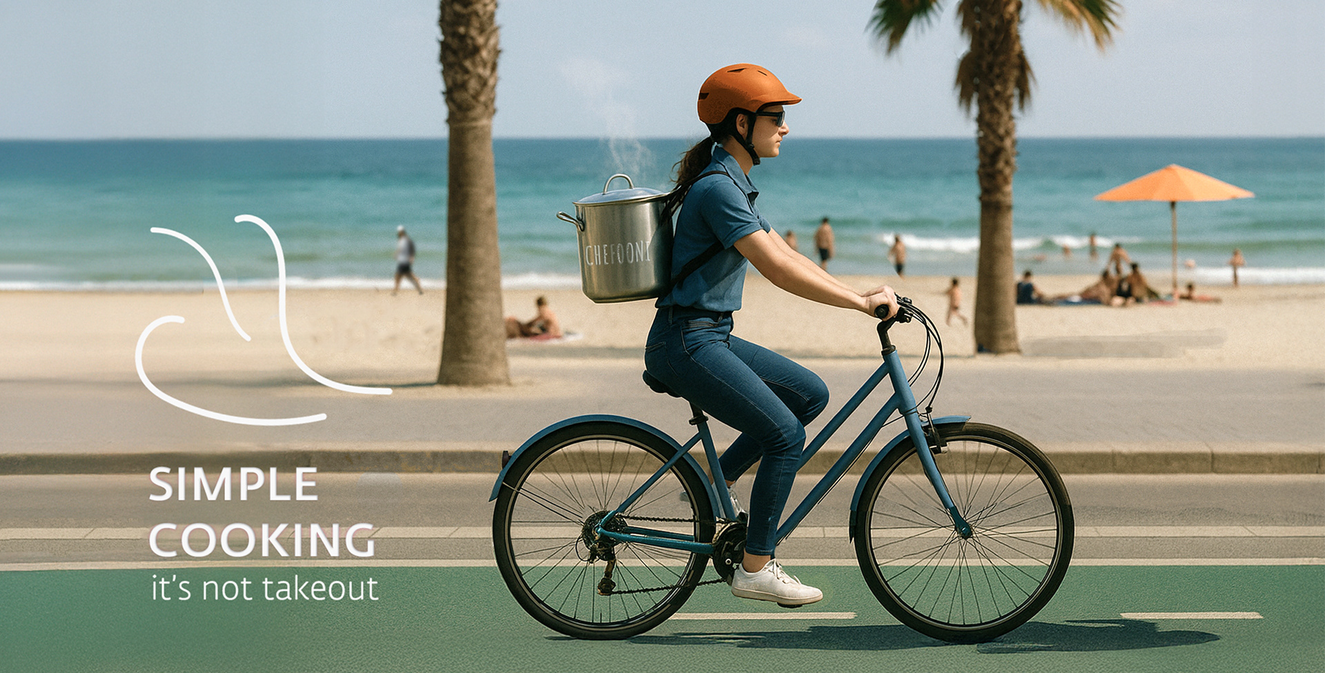
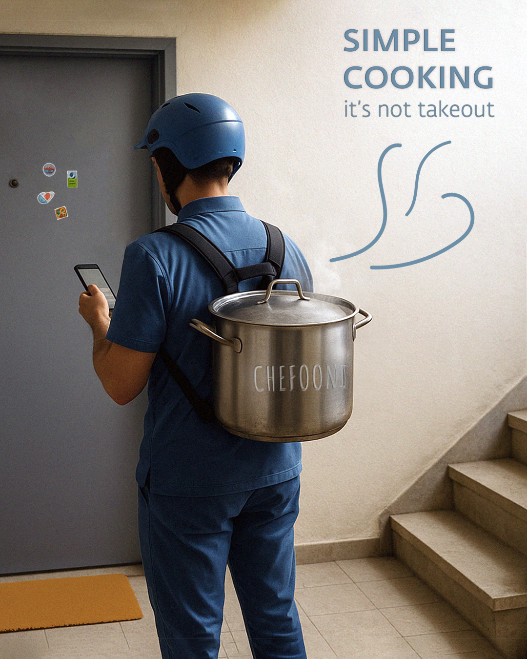
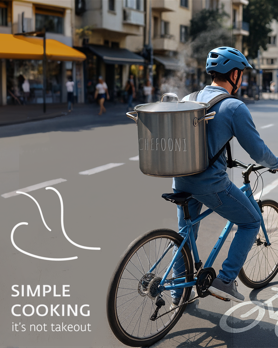
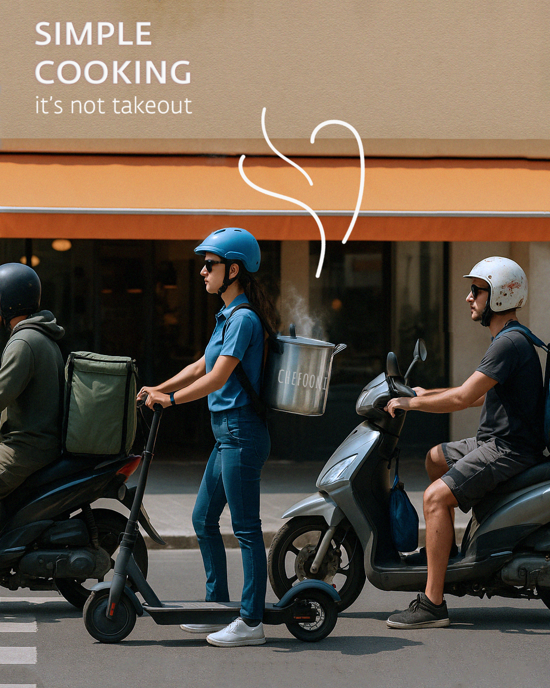
A pot for everyone. every lifestyle.
It can hold anything, from Italian minestrone to Indian Daal or Hungarian goulash.
It can hold anything, from Italian minestrone to Indian Daal or Hungarian goulash.
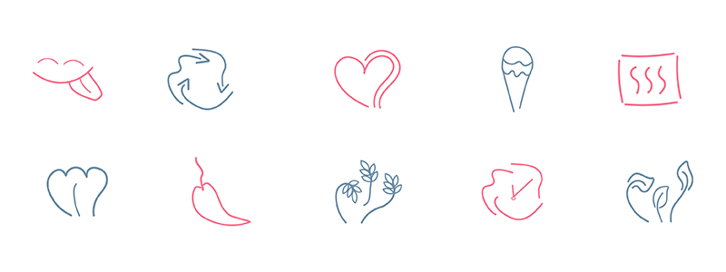
Fonts, Colors, Icons
Primary Font — Amatic SC
Friendly, hand-drawn letters that convey simplicity and approachability, like a recipe anyone can make.
Friendly, hand-drawn letters that convey simplicity and approachability, like a recipe anyone can make.
Tagline Font — Liebling
Clean and stable, balancing the headline font and adding a sense of trust and professionalism.
Clean and stable, balancing the headline font and adding a sense of trust and professionalism.
Body Text — IBM Plex Sans
Modern and easy to read, used for longer texts and explanations to maintain clarity and structure.
Modern and easy to read, used for longer texts and explanations to maintain clarity and structure.
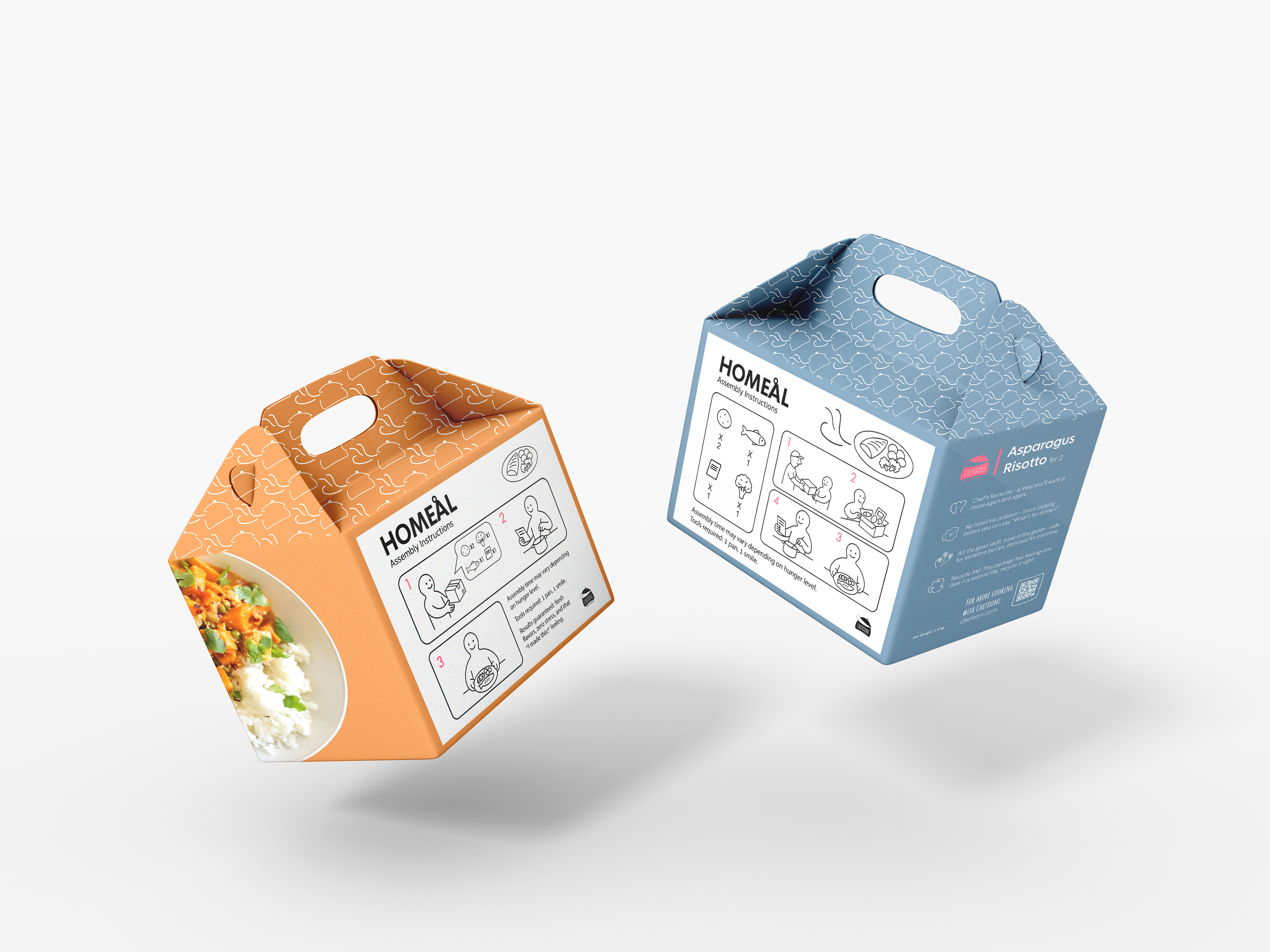
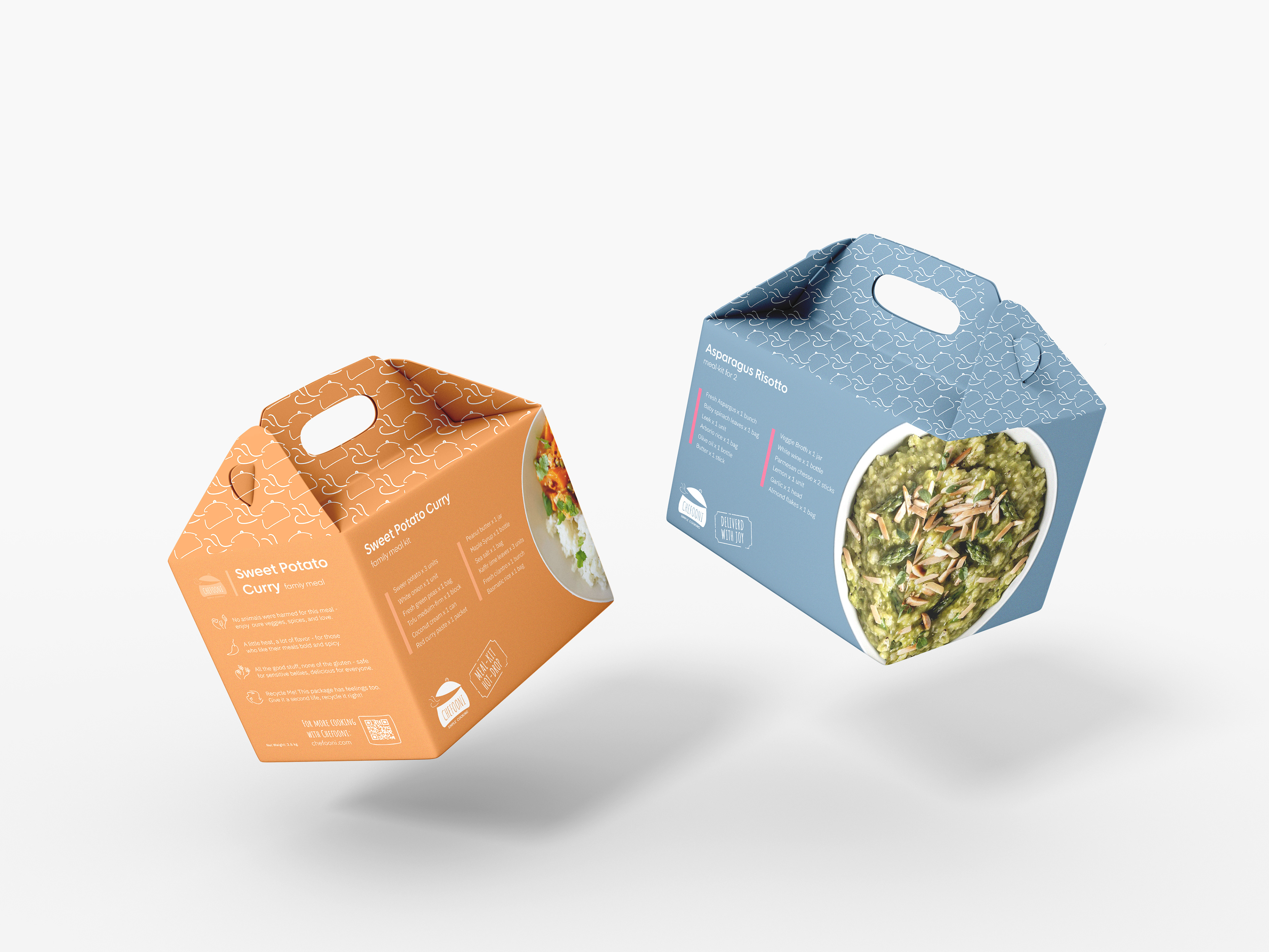
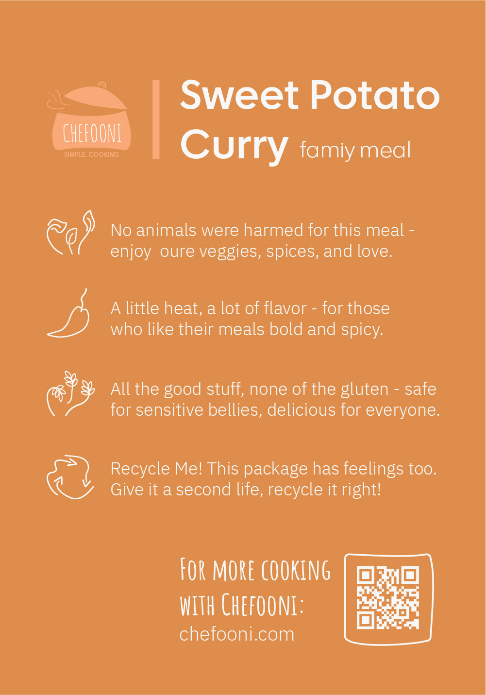
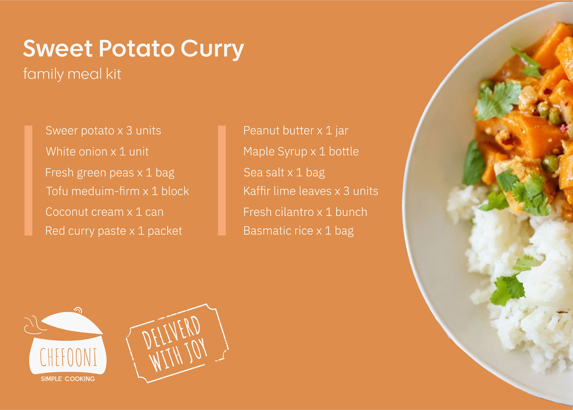
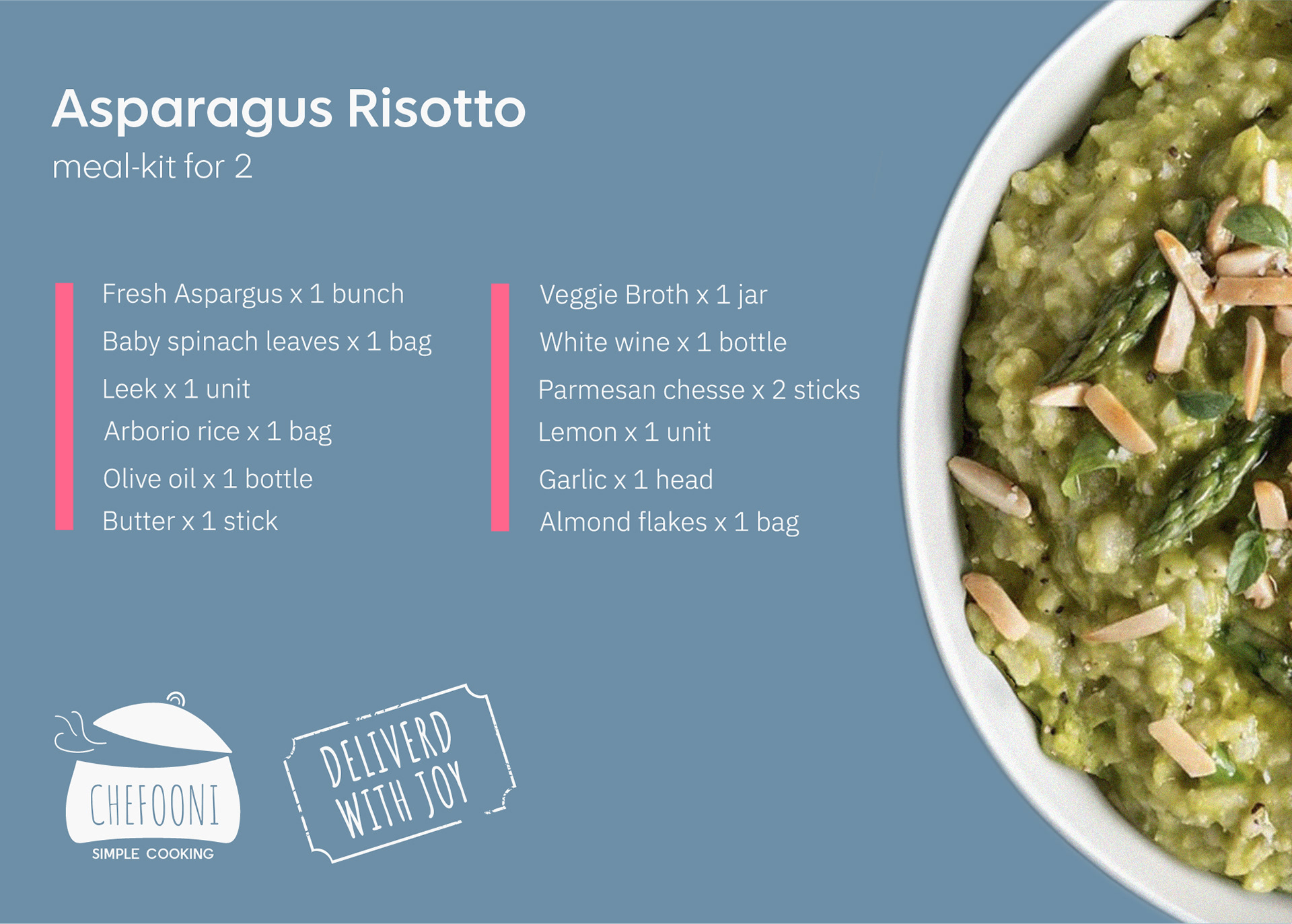
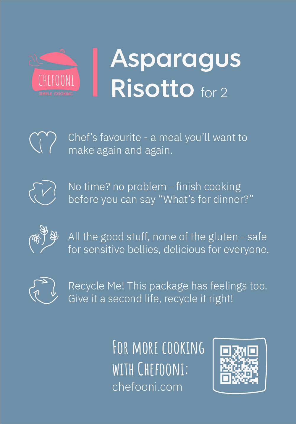
Packaging
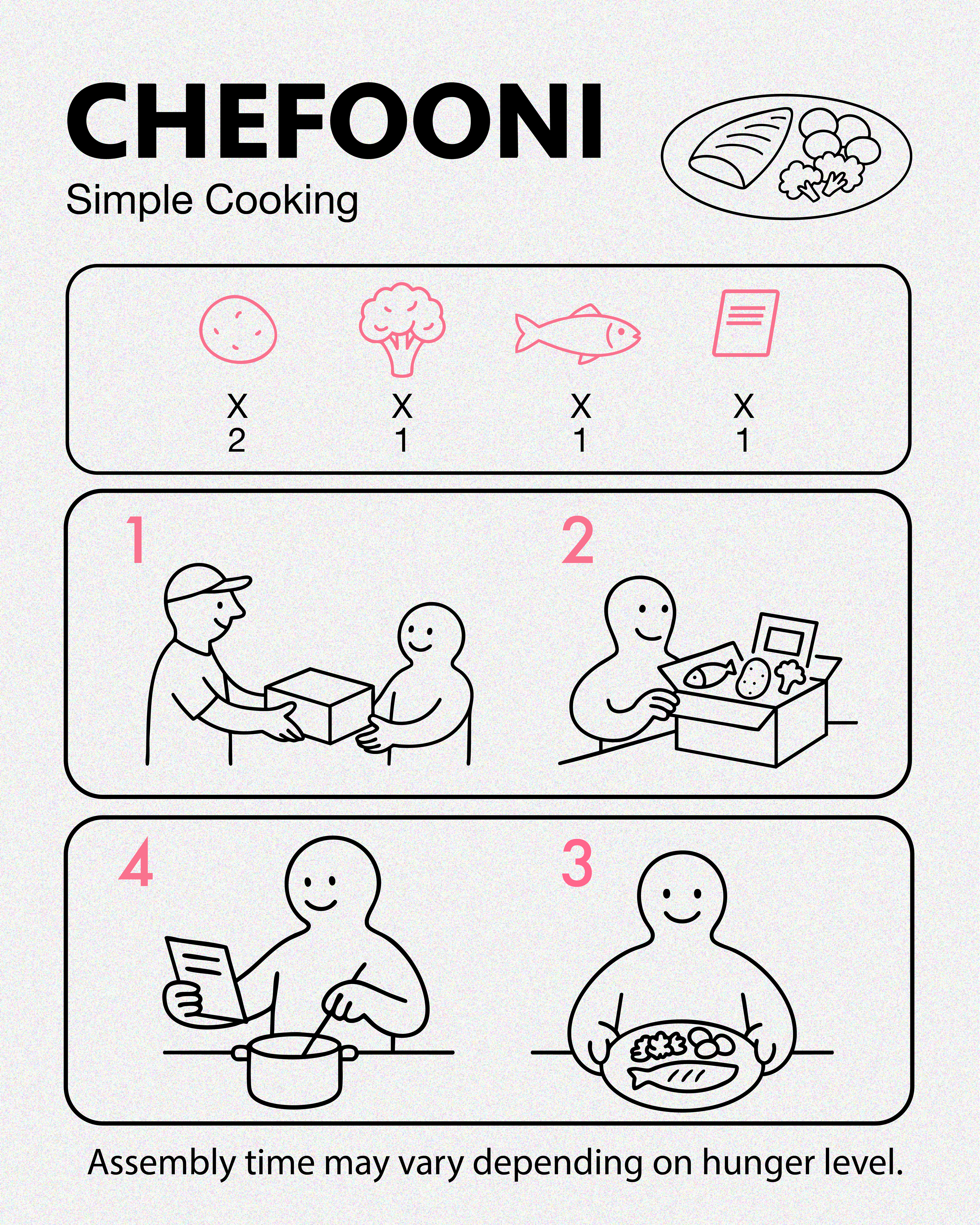
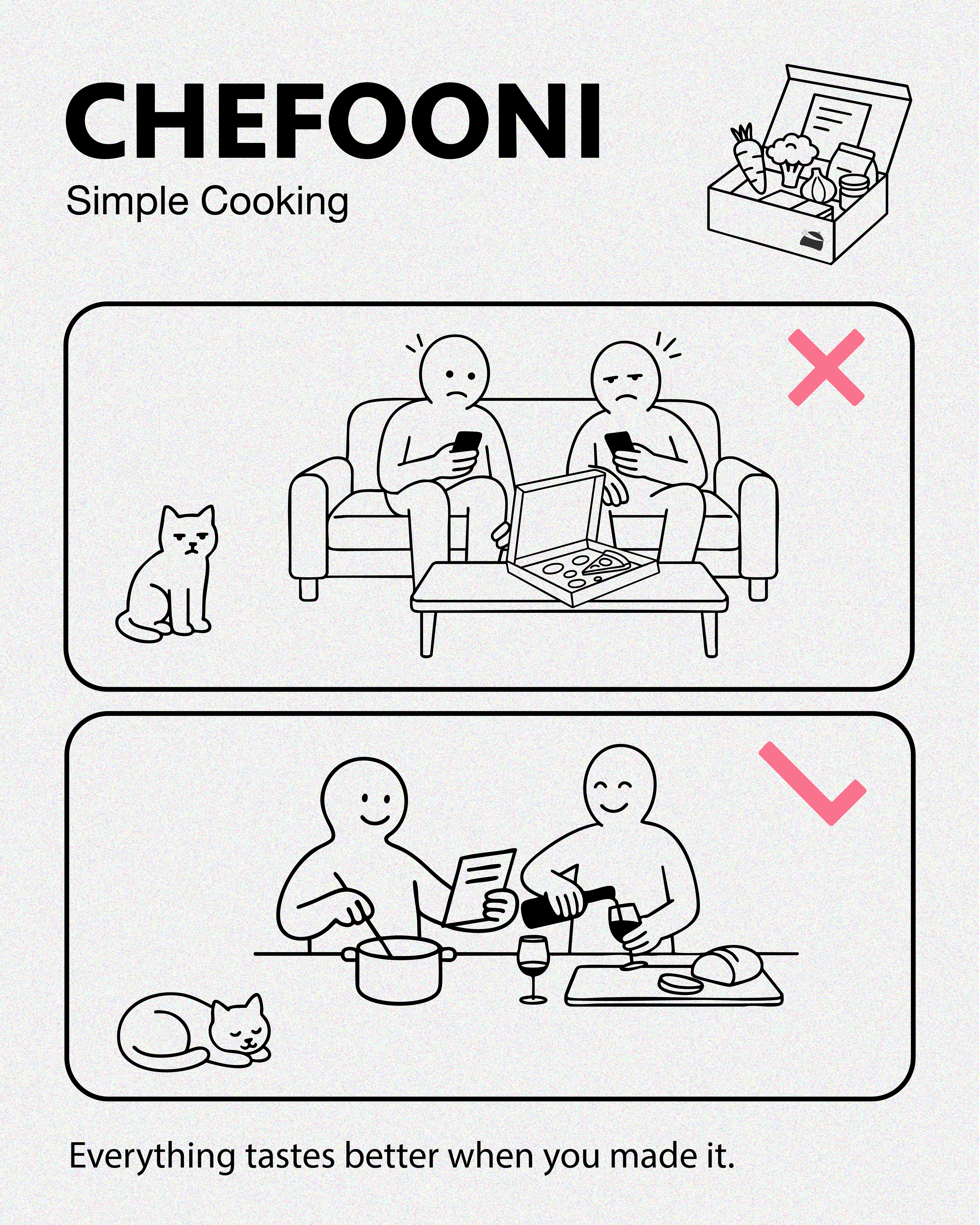
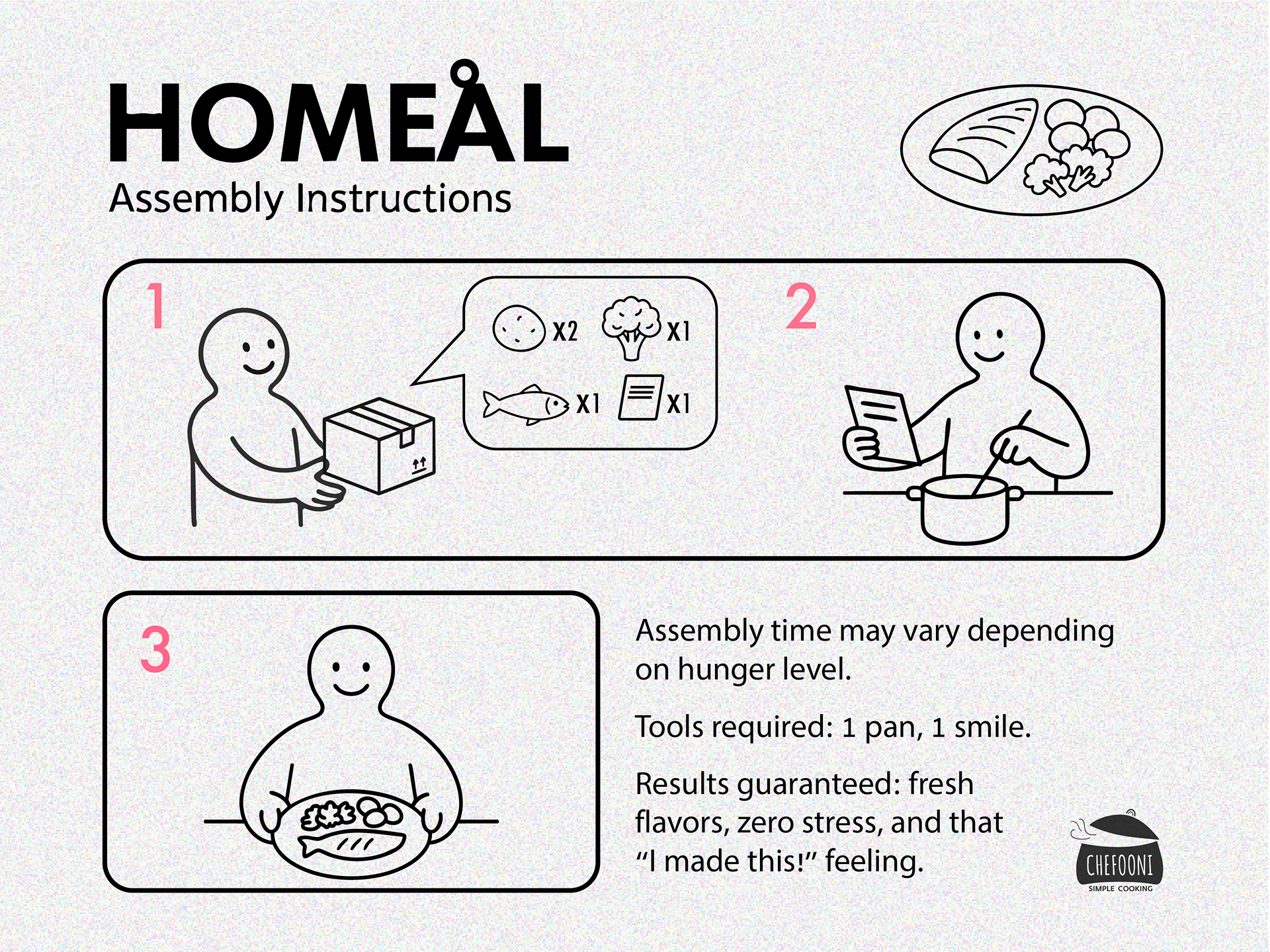
Ads
This project taught me how to translate a simple everyday need into a joyful, human visual identity.

Designed by Anat Melamed as part of the Studio 6B web design program (2025)